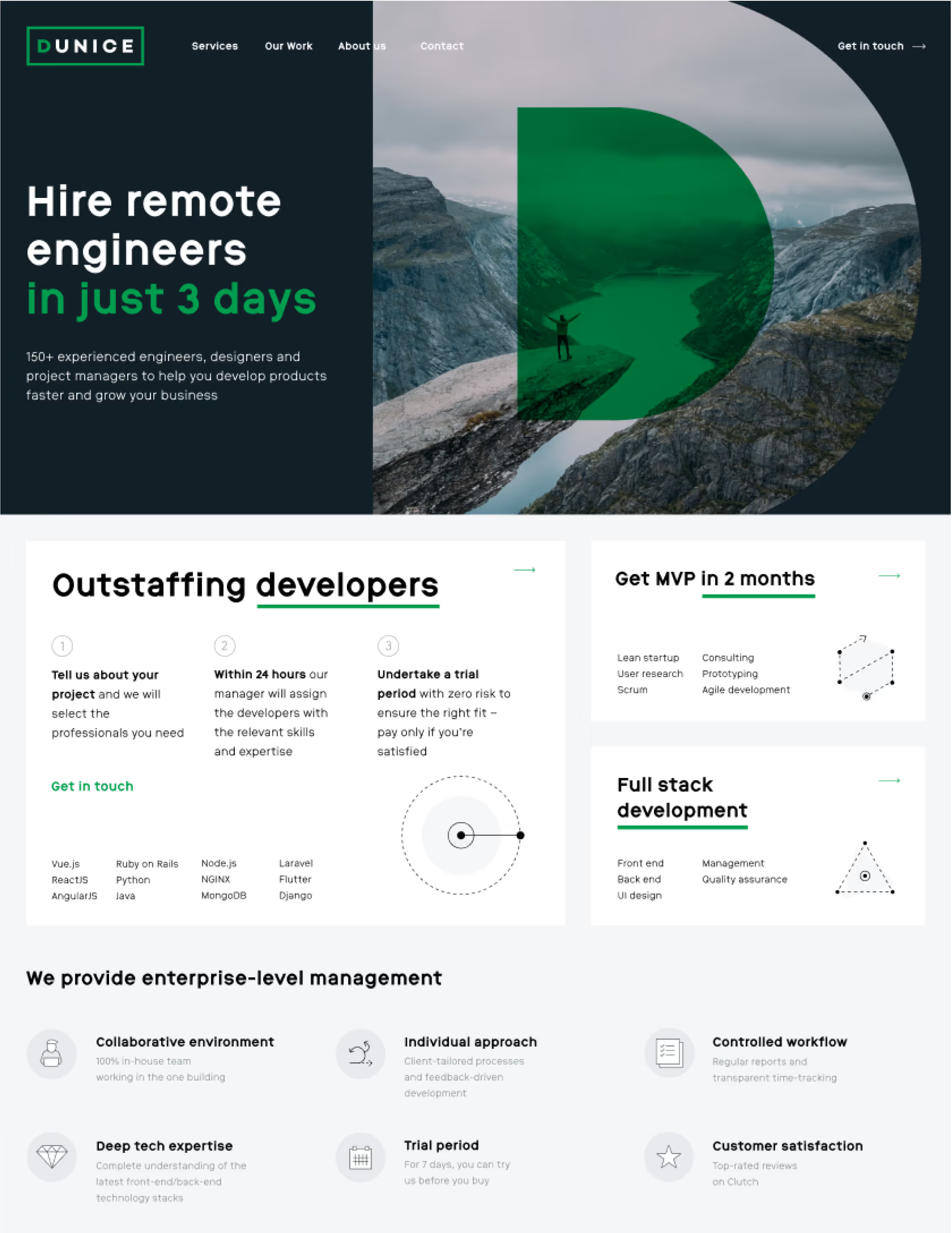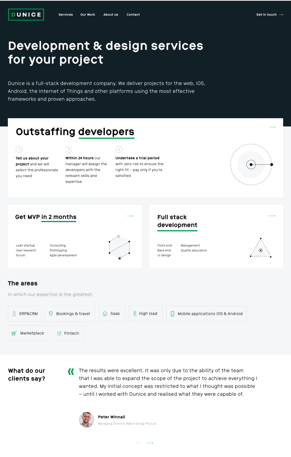
This is a classic example of a website redesign for a prominent IT company in the region. Dunice has reached a stage where they can confidently handle A-class clients and projects, and their new website needs to reflect their expertise, experience, and scale.
To ensure an optimal user experience, we began with thorough UX research. Based on the insights gained from the Customer Journey Mapping (CJM), we created a wireframe prototype. After several refinements, we seamlessly transitioned to the adaptive design creation phase.

We’ve undertaken a comprehensive overhaul of the website’s structure and content presentation, resulting in a hi-tech appearance that compellingly showcases Dunice’s services and advantages. Each service page boasts its own distinctive visual representation, ensuring easy navigation. Neatly designed icons draw attention to key points within lists, while every case study on the site is assigned a distinct color for better differentiation.

The company’s core strengths and capabilities are prominently displayed and clearly articulated. The case studies are organized within a portfolio, with cross-links connecting them to relevant service pages. Additional pages on the website provide insights into Dunice’s working process, company history, market positioning, and educational initiatives.


The website has been developed with a multilingual approach. Each language version includes nuances tailored to specific local markets, reflecting the differences in the company’s positioning. The mobile versions of the website also support incorporate this level of customization.


