
Designing DNA
for a fintech
platform brand
Leverate runs the technology behind hundreds of brokerages worldwide. After 18 years of growth, the brand needed to catch up with the company. We rebuilt it from the atoms into one living system.
Starting from the brand values. Everything below is how we translated them into a working visual language.
The values


Setting up the stage
We started with the smallest building blocks:
— Slightly modernized logo
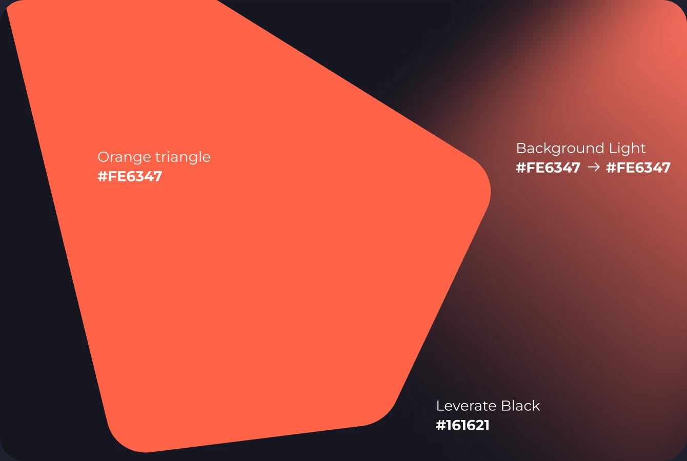
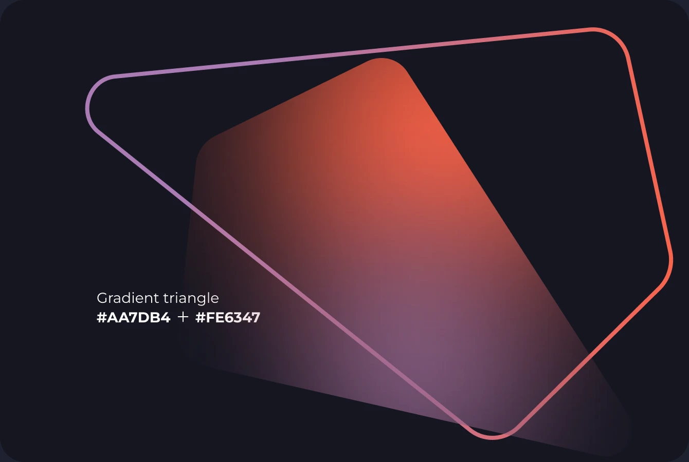
— A triangle shape
— Branded Orange color against deep Leverate Black
— Factor A, engineered for clarity at any size
— A spotlight
The rest of the design system evolved from these elements.













Cutting out mutations
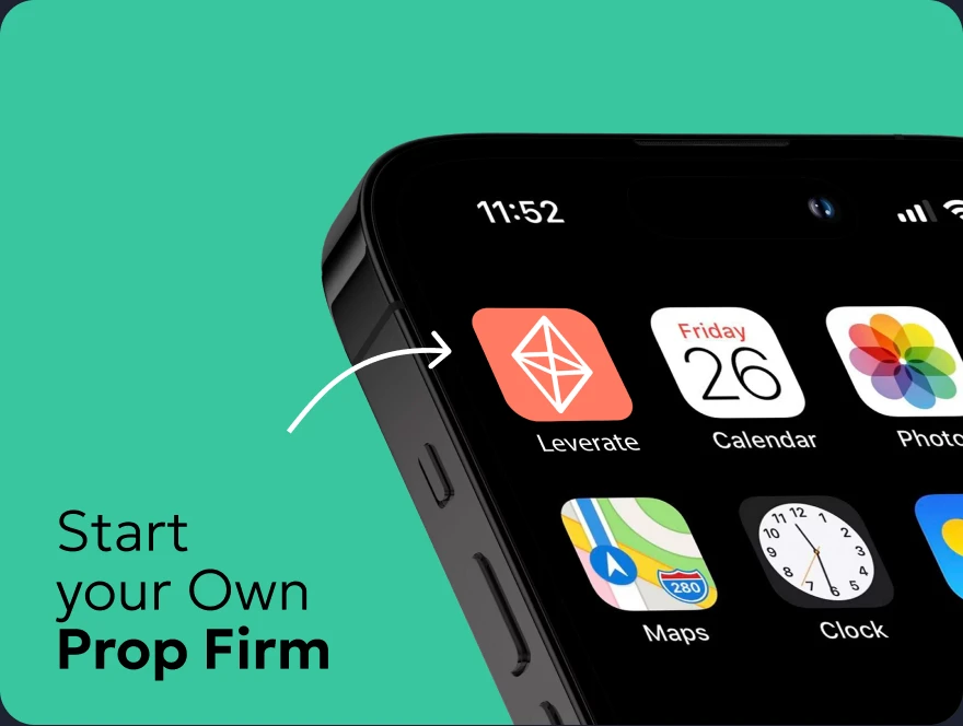
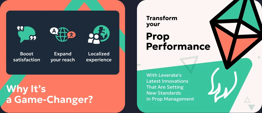
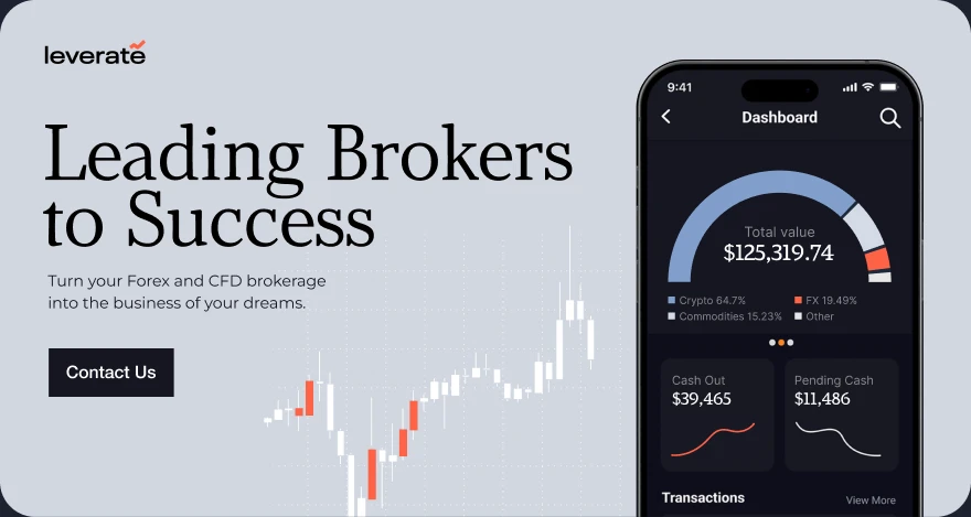
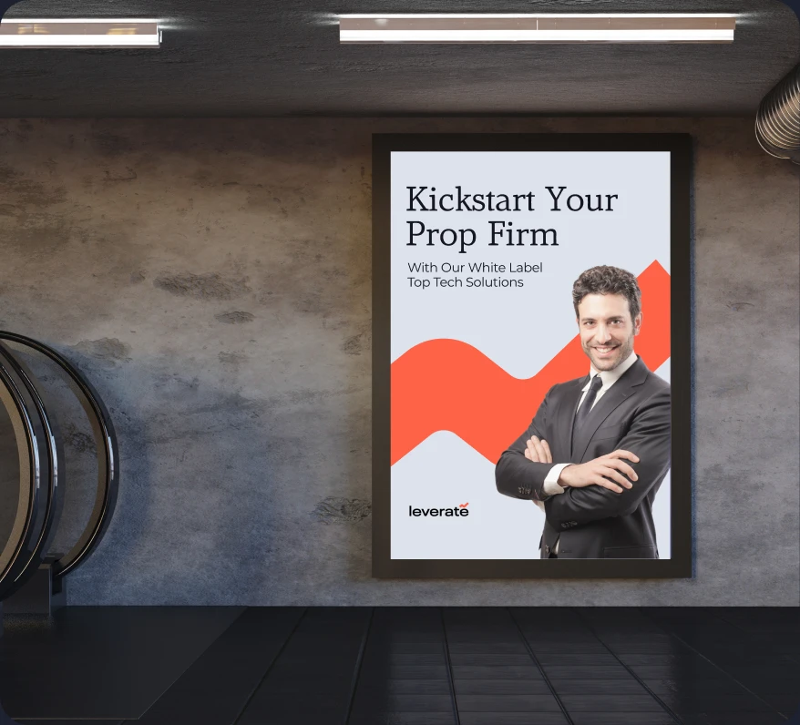
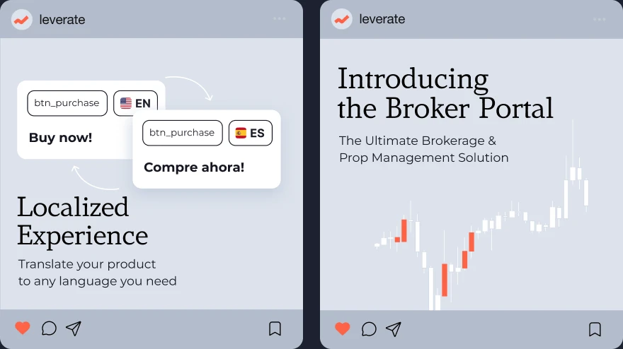
Not every idea survives. We explored several visual directions before settling on the final approach.
We had different ideas on logo and style.
In the end, the strongest ideas earned their place in fierce competition.

Constructing the website
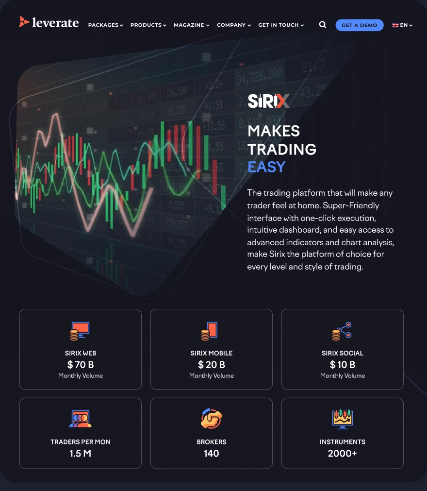
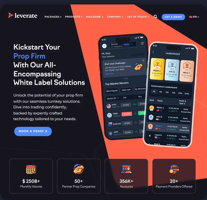
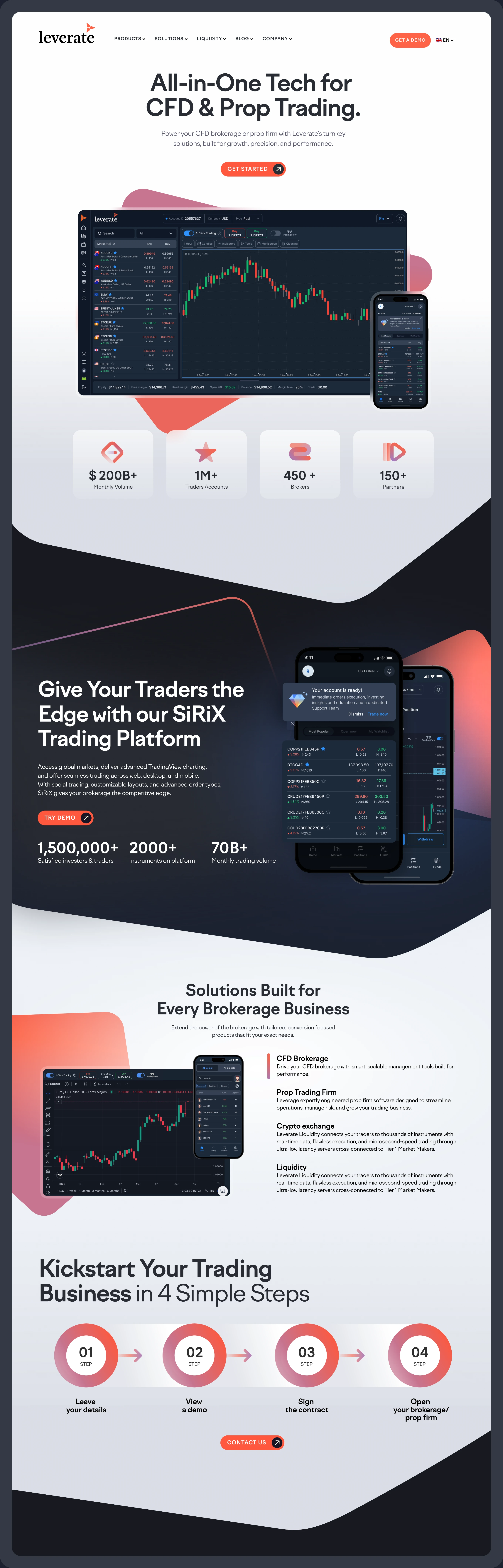
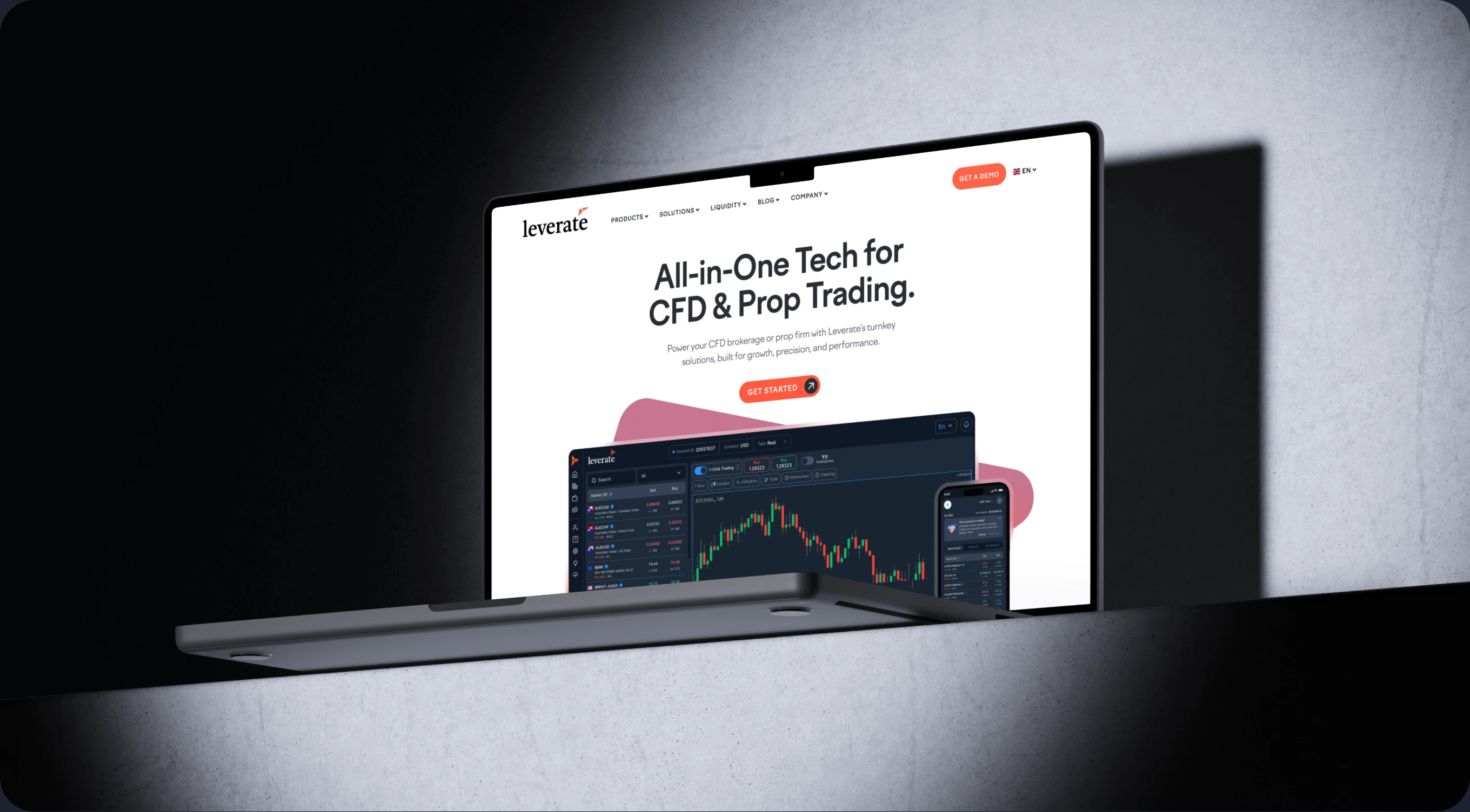
First big test was to apply this style to the web.
In 2 months of redesign we have completely covered the whole company website with the new design.
Every product has it's own page. Each page utilizes the same brand components.
Spacious pages with products in the spotlight and developed visual language to convey marketing value.
Putting things in perspective
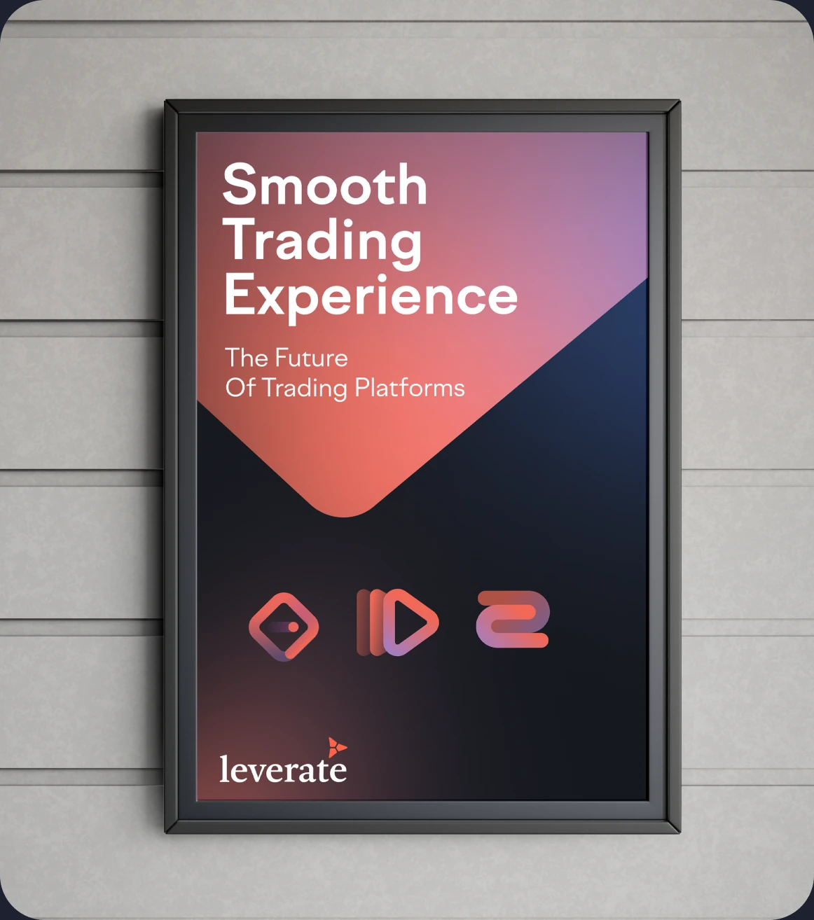
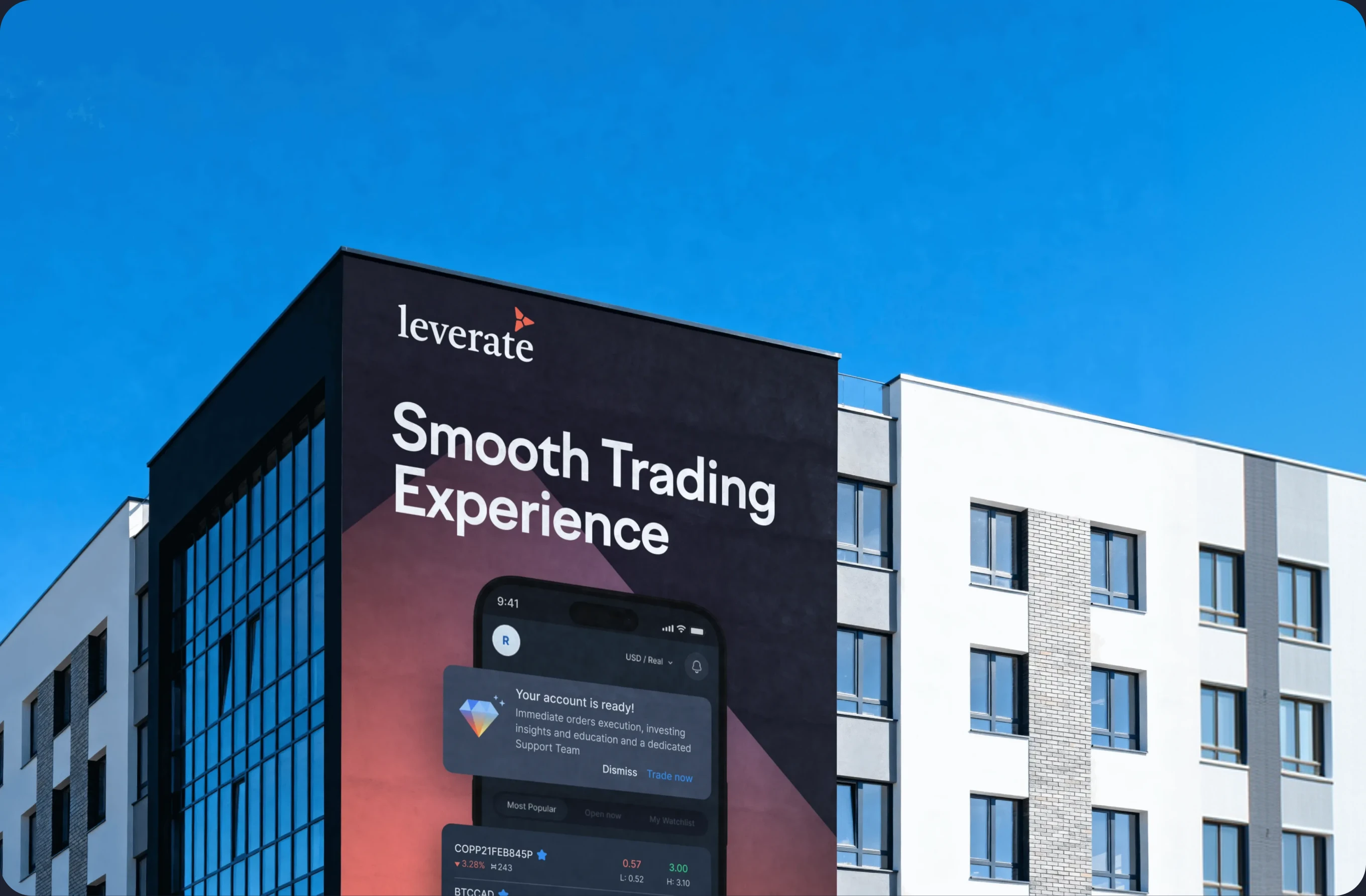
A brand truly earns its place in the world when it goes physical.
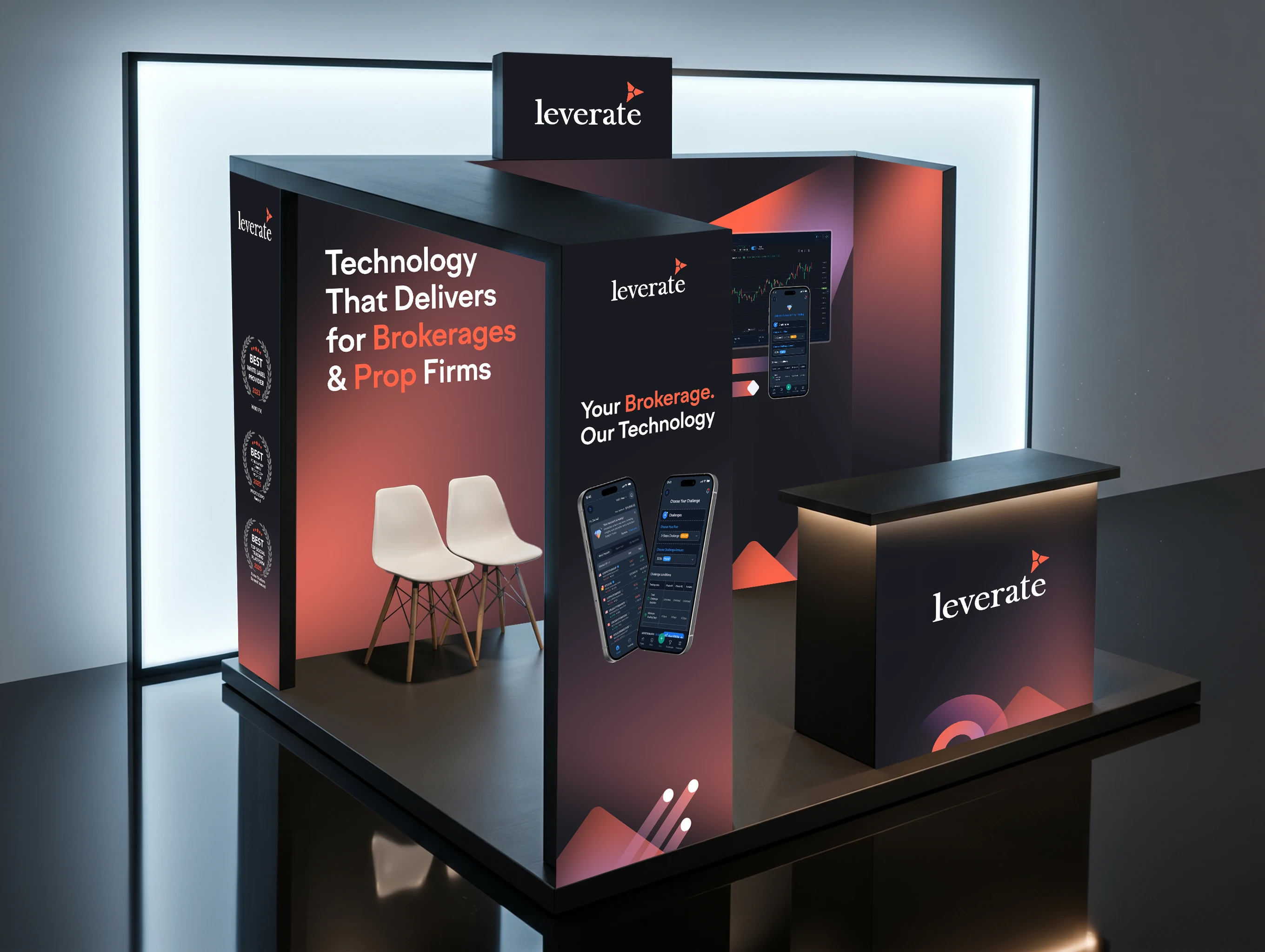
We designed several expo stands across UAE, Mexico, Cyprus, Asia, LATAM.
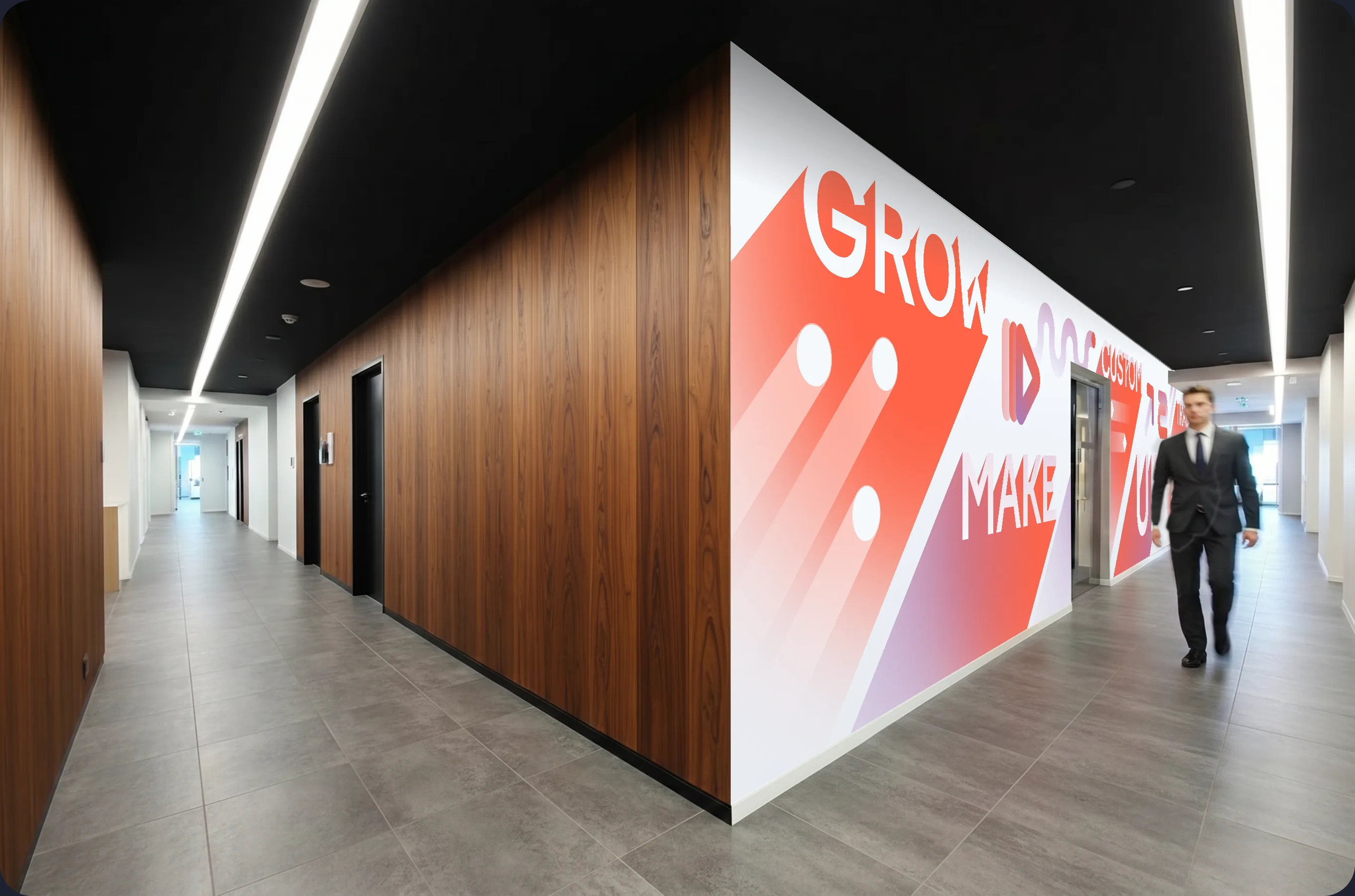
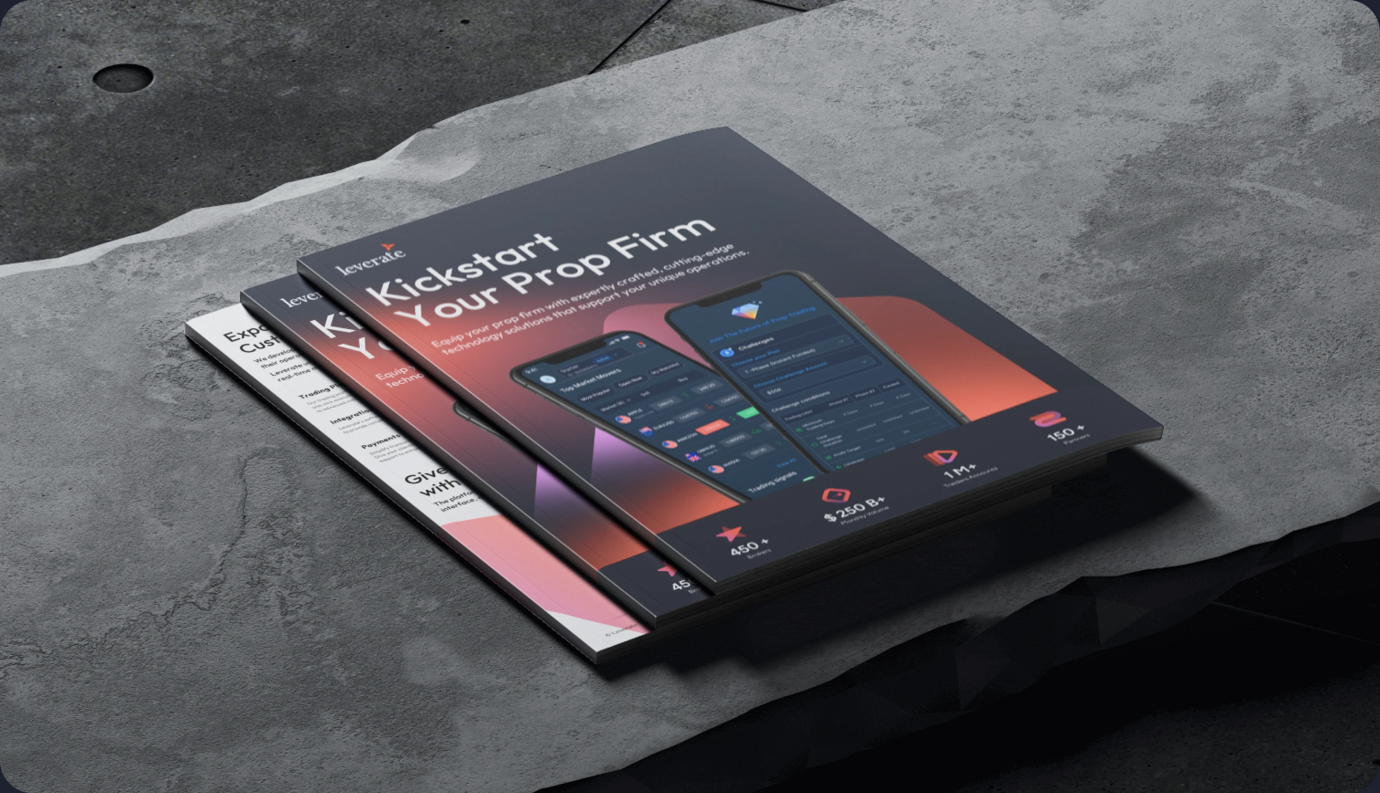
An office wall in Tel Aviv. Printed brochures in English and Spanish.
Suddenly the language is everywhere — radiating outward, holding its shape across surfaces and scales.
Mapping the Leverate Universe
Leverate has a constellation of products.
SiRiX at the top as the trading platform. Prop is the next direction.
CRM, Capital, Risk and Affiliates are infrastructure modules.
Each gets its own mark, its own design treatment, and all of them live in the same brand universe.






Replicating the UI
Branding a marketing page is one thing.
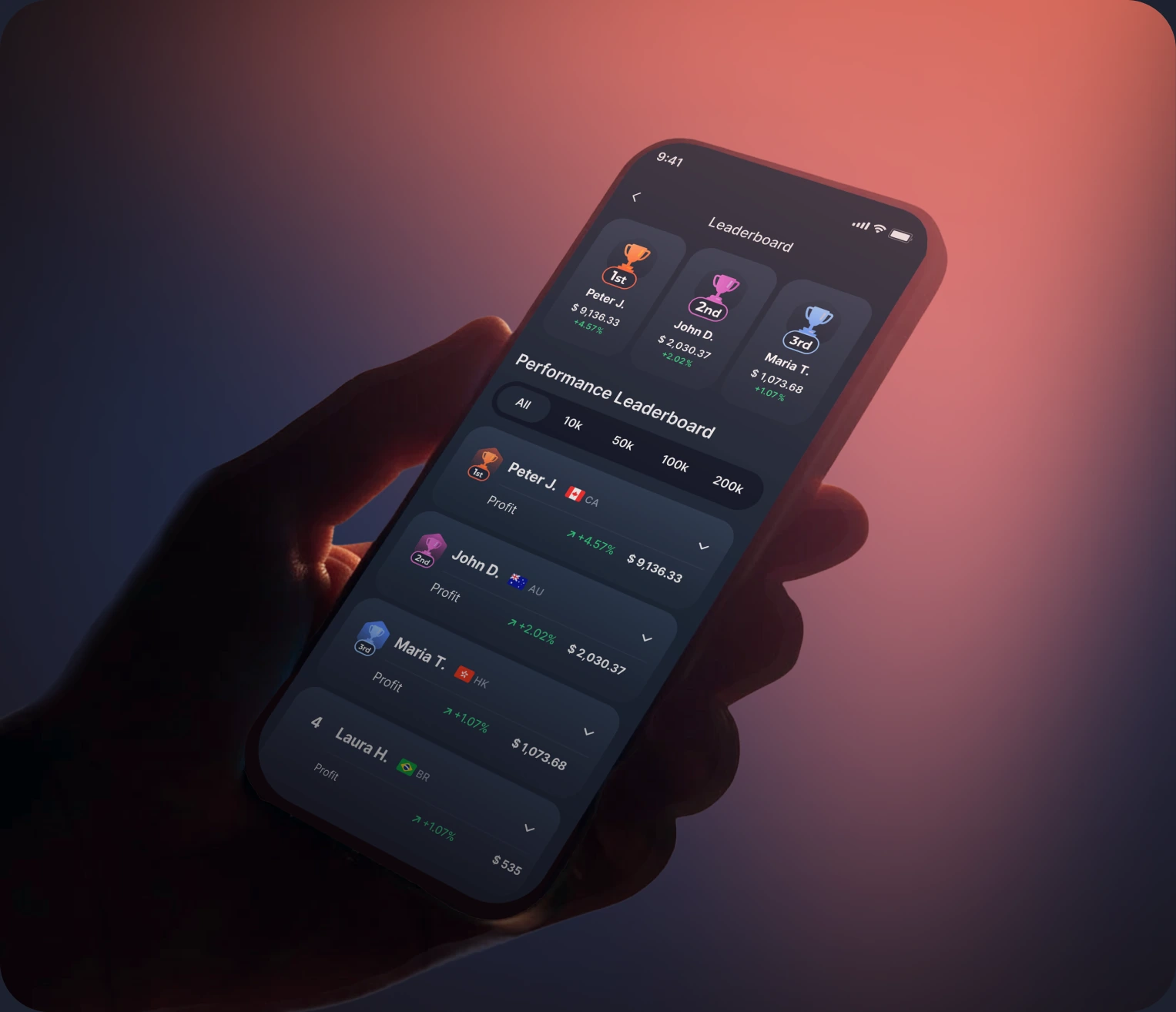
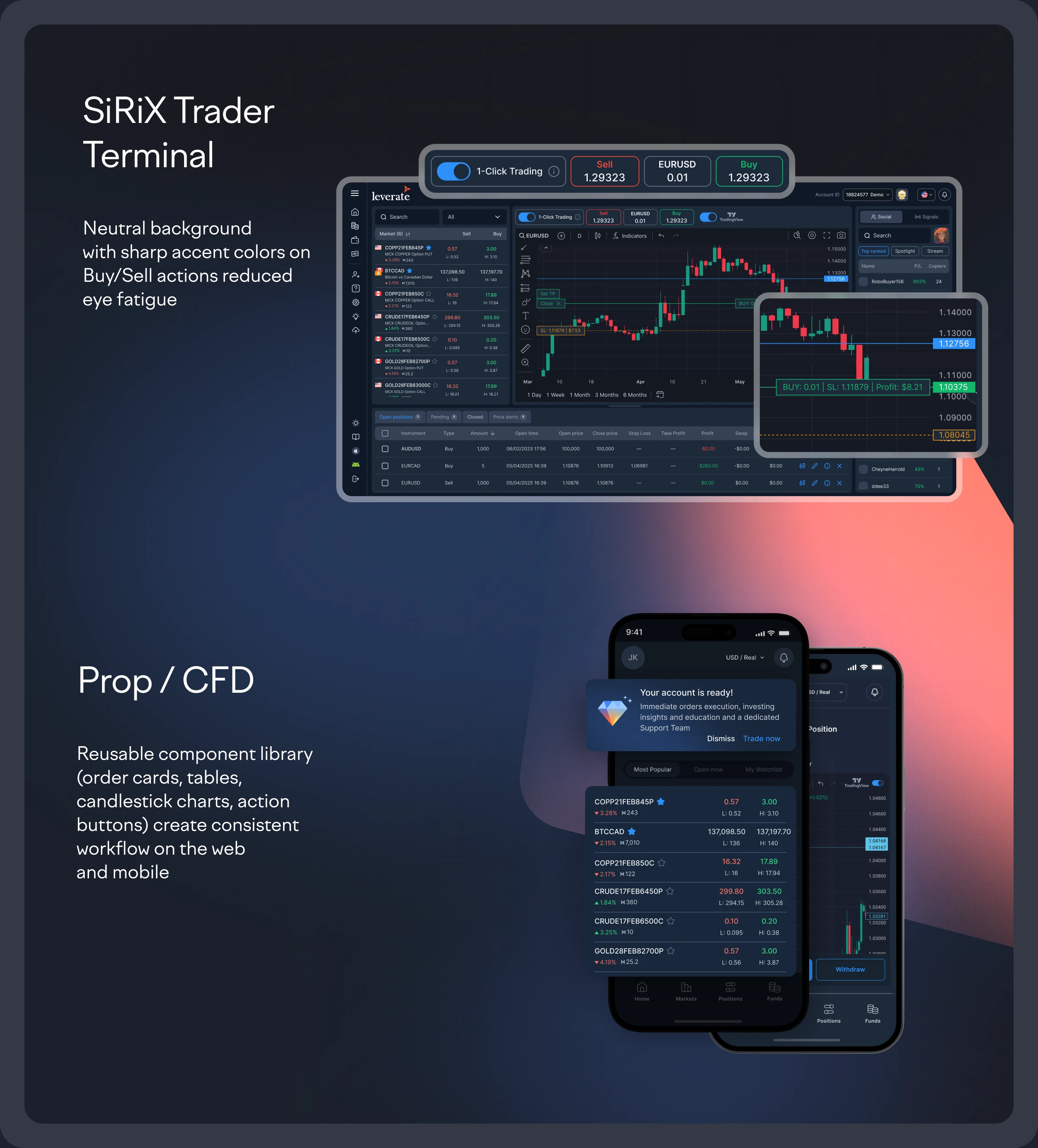
Creating efficient 24/7 Trading terminal UI is another.
These screens are calibrated for the trader's eight-hour working day.
We took the new language and pressed it into every key product surface: assets, order management, dashboards, trading history, account setup. ~30% of screens were redrawn from the ground up; every key trading scenario was optimized
The result reads as one Leverate brand. Whether you're a trader on web, an account manager on the broker portal, or a partner in the affiliate dashboard.
Printing a new reality
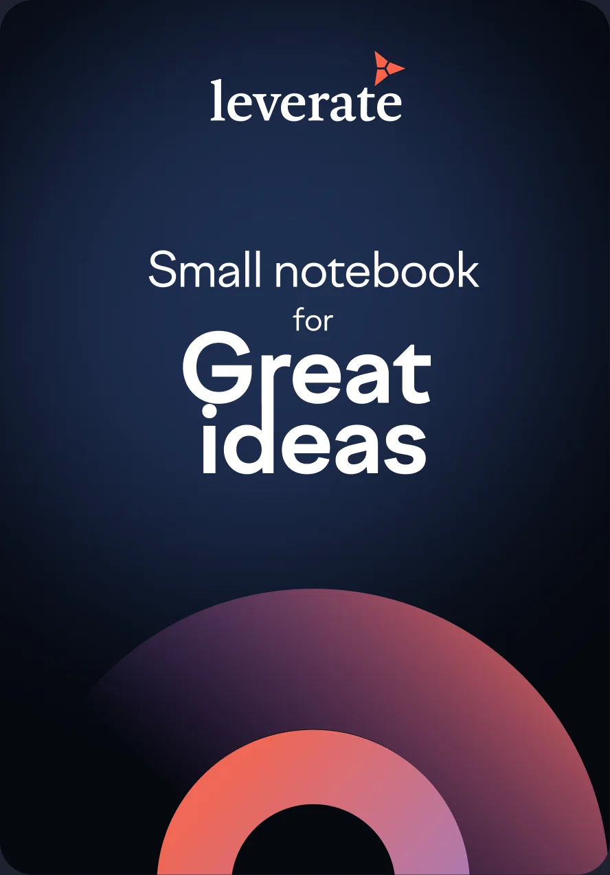
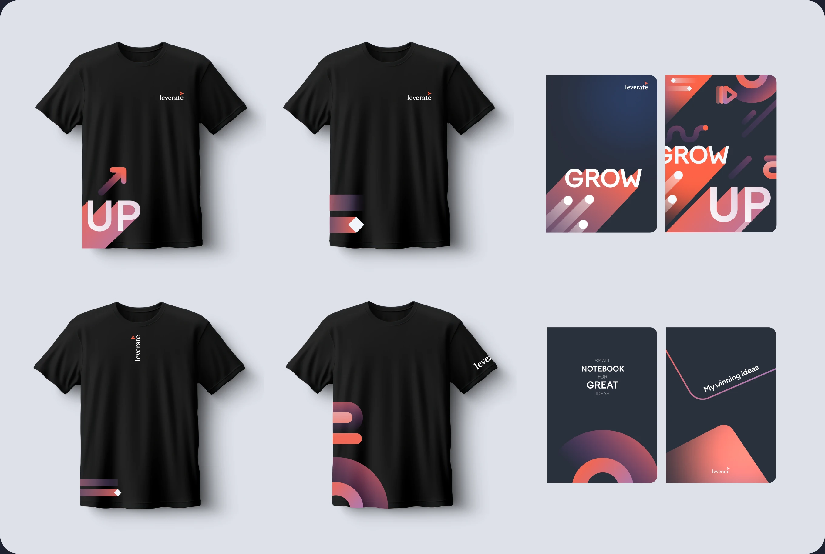
When a partner picks up a Leverate notebook in Limassol and opens leverate.com a week later, they feel like opening the next chapter of the same conversation.
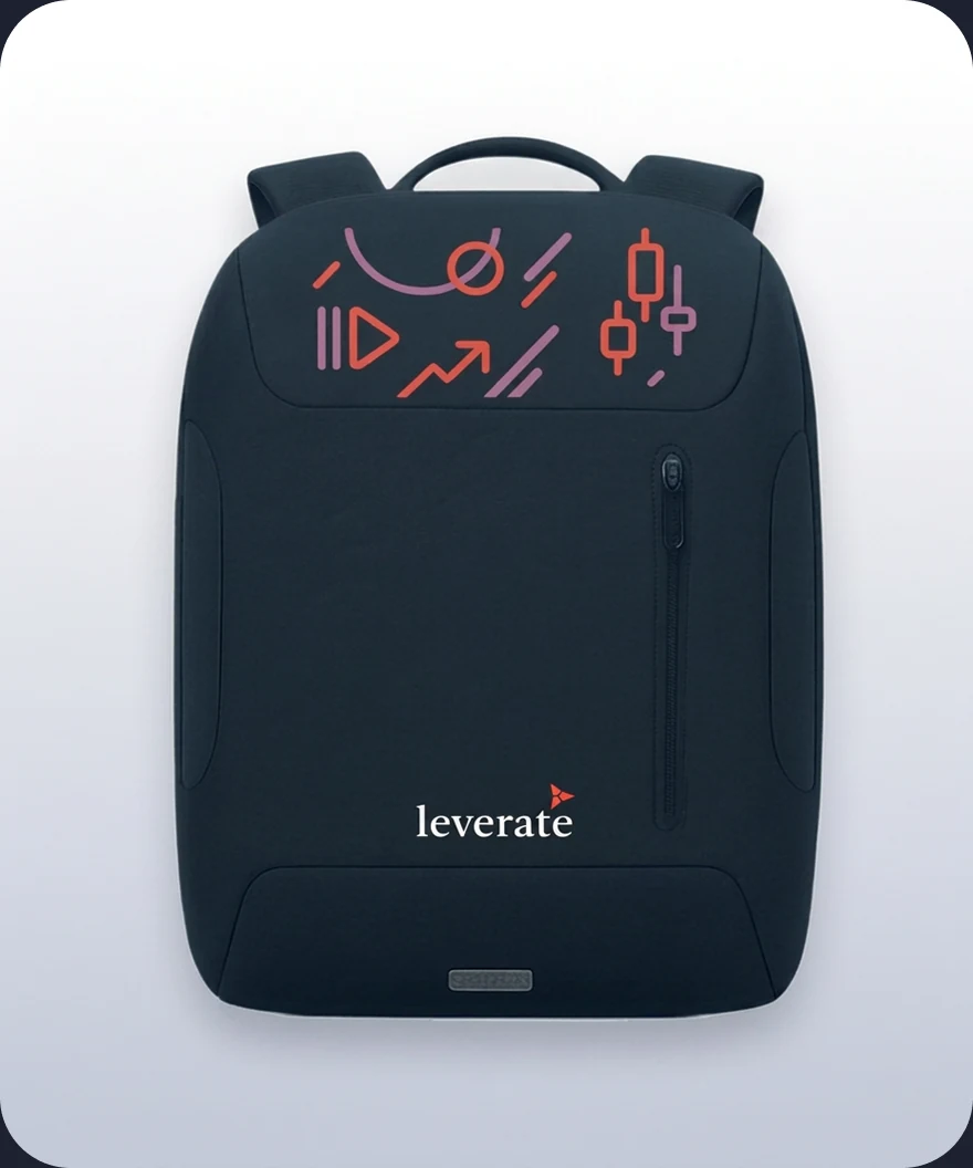
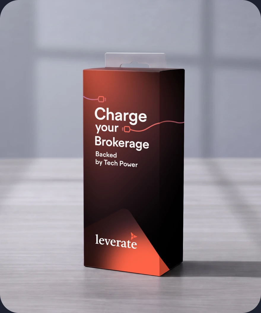
T-shirts, notebooks, backpacks, hoodies, powerbanks...
Designed to feel like a precision tool, not a giveaway.
Each piece carries a message from the brand: Hi-tech · Innovation · Trust · Customization · Growth

An encompassing brand book
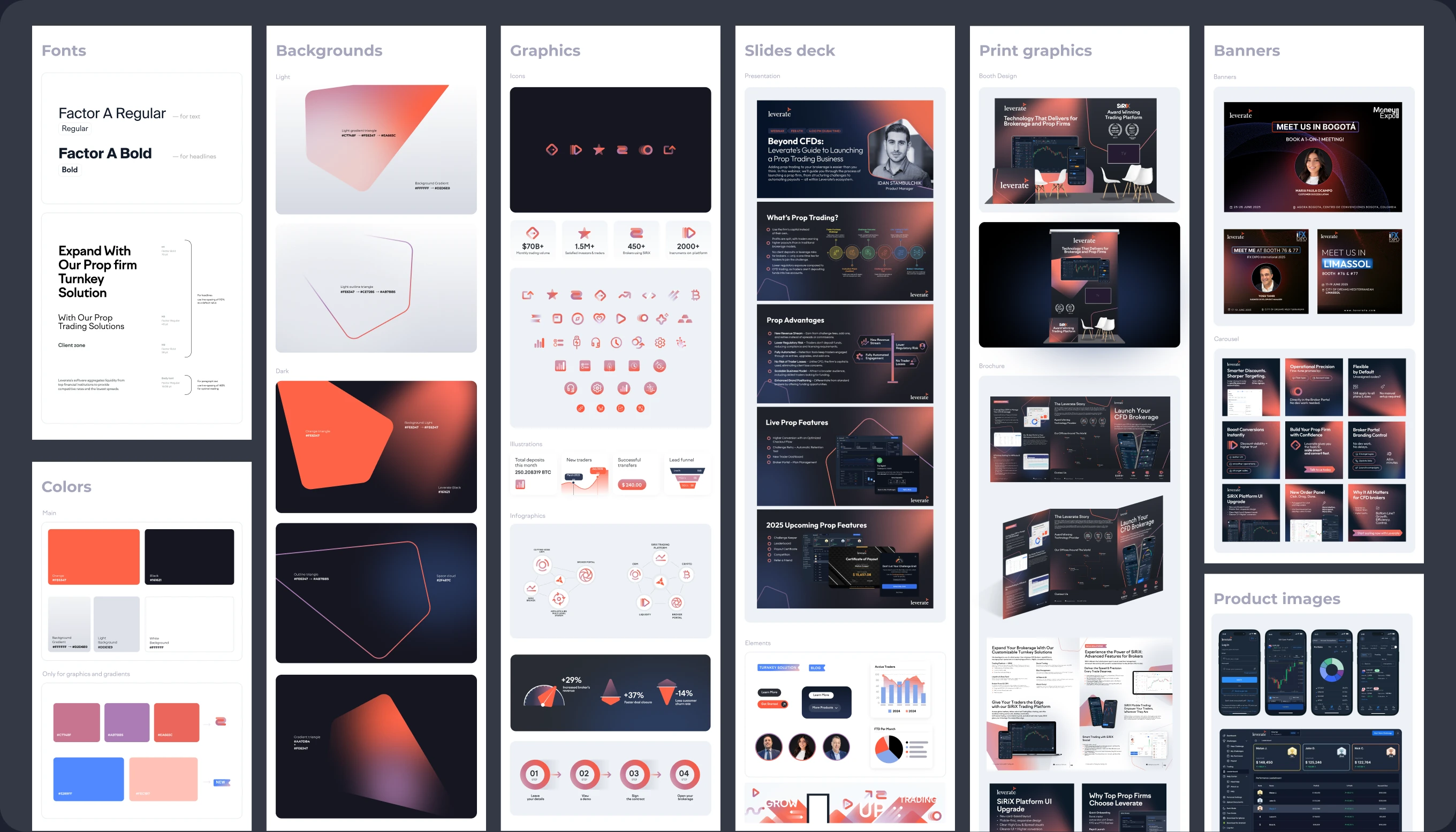
The brand book is an essential component that makes this design scale well.
Inside:
- Typography
- Color and gradient system
- Recurring graphic blocks
- Icons
- Branded backgrounds
- Logo do's and don'ts
- Tone of voice
- Image usage rules
- Business cards
- Brochures templates
- Banners system
- Merch print files
- Expo stand designs
- Website templates
- Email signatures
- HubSpot template
It has practically everything Leverate's marketing team needs to ship new work every day
Why it worked
-
C-Level executives fully involved in the process Leverate showed up week after week, gave detailed feedback, and pushed the process forward.
-
Parallel tracks that didn't collide Each workstream — brand, product, web, print — had its own dedicated designer and its own client counterpart. Tracks moved in parallel without blocking each other, so the output compounded instead of queuing.
-
A gradual buildup of the brand style We didn't start with the brand book. It naturally evolved along with the building of the website, constructing the UI and printing the merch. Brand book was not a starting point, it was the destination.
Final thoughts
8 months rebranding project. Design team of 10.
A new visual DNA that now runs from the trading terminal to the print booklet.
From the web pages to office walls.
The marketing team can now ship a new banner, a new brochure, or a new landing page without our involvement.
The product team can ship new UI features without re-deciding the visual language each time.
If you're scaling a multi-product company and your brand is no longer keeping up — let's talk.
We know how to build and scale design systems like this.
Credits
Phil Smirnov
Design Director
Anna Gapeeva
Lead Product Designer
Masha Yekimova
Art Director
Natasha Bulanova
Designer
Liza Plakhotnaya
Print Designer
Nikita Kozlov
Pre-Press
Elena Nochka
Operations & PM
Sergey Maximov
Designer
Sonya Alyabeva
Designer
Maria Korol
Designer
Yael Almor
VP Product & Deputy CEO
Gil Ben Yelid
Management
Idan Stambulchik
Product Manager
Matan Funes
Head of Marketing
Ortal Nachum
Marketing Operations